
Welcome to another entry in MAUI UI July! An initiative hosted by Matt Goldman celebrating all things UI in the context of .NET MAUI. A common misconception for .NET MAUI is that you can’t make great UI, which the other participating authors in this series have hopefully debunked already. With the intro out of the way, let’s dive into our topic of the day: a styling experiment I recently did.
A note on the king of styling things: CSS
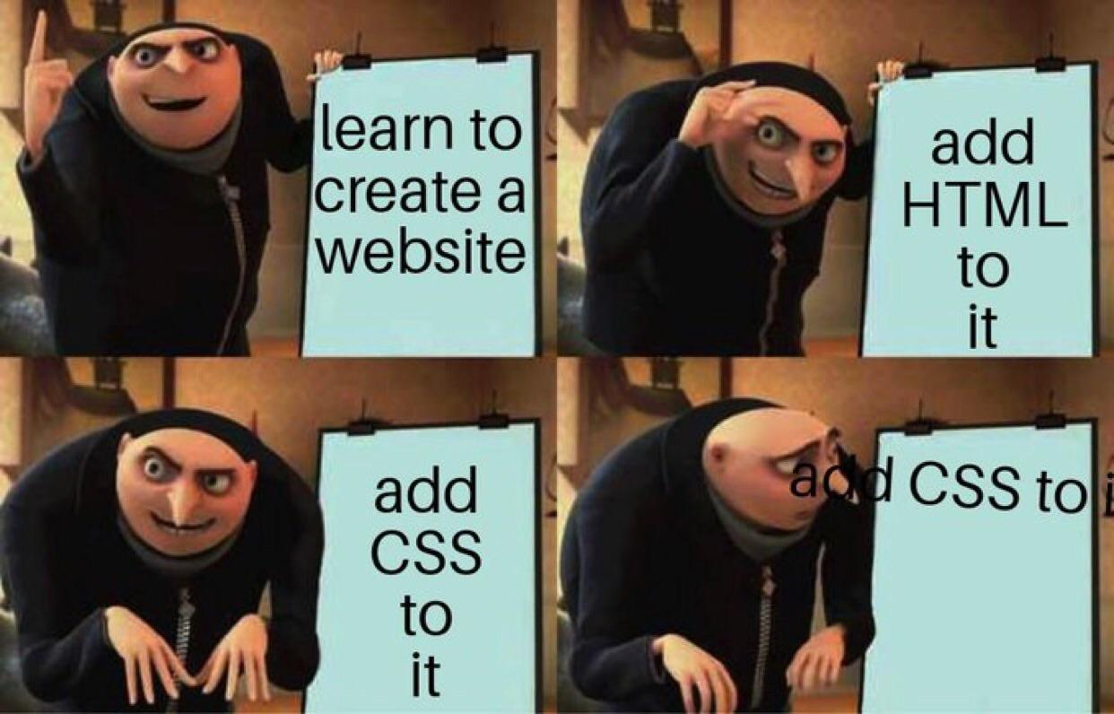
If you’ve done any web development of any sorts it’s likely that you’ve been in touch with a bit (or maybe too much for your liking) CSS. It’s the standardized way of styling for the web, but doesn’t typically reach outside that domain. When it comes to .NET MAUI; there is some support for CSS, which roughly entails mapping CSS properties and selectors to various properties on visual elements under the hood. Because .NET MAUI works with fixed properties, this mapping isn’t very flexible and greatly dependent on the support that the .NET MAUI developers add.
 Ah, good old CSS.
This immediately touches upon a pain point; CSS in .NET MAUI doesn’t have a broad userbase, meaning that support from the developers is always going to be limited. Styling through XAML or code-behind is simply more common. Certain parts of the CSS specification also don’t quite line up with what .NET MAUI offers, meaning certain parts of CSS are ignored, and custom attributes that don’t exist in CSS are added to cover the needs of .NET MAUI.
Enter the CSS frameworks
In typical developer fashion, when we find something that works pretty well, we layer on additional abstractions to make it feel even simpler. For CSS, this is where utility-first frameworks like Tailwind come in. Tailwind gives you a set of low-level utility classes that let you build designs directly in your markup without writing custom CSS, promoting consistency and speeding up development while still giving you full control over styling. Need some padding on an element? Just apply the p-3 CSS class. Below you’ll find a bit of Tailwind-styled HTML, to give you a general idea.
<div class="flex flex-col items-center gap-6 p-7 bg-slate-200 md:flex-row rounded-2xl">
  <div>
    <img class="size-48 shadow-xl rounded-md" alt="" src="/img/cover.png" />
  </div>
  <div class="flex items-center">
    <span class="text-2xl font-medium">Class Warfare</span>
    <span class="font-medium text-sky-500">The Anti-Patterns</span>
    <span class="flex gap-2 font-medium text-gray-600 dark:text-gray-400">
      <span>No. 4</span>
      <span>·</span>
      <span>2025</span>
    </span>
  </div>
</div>
I won’t go into depth on all the things that Tailwind packs, let’s just go with the fact that it’s pretty extensive. Tailwind tends to be polarizing though. Fans appreciate the speed and consistency with which you can pump out a good-looking design. Critics argue it clutters HTML with class soup. I can see a case being made for either to be honest, and while I hate soup I do enjoy not having to write truckloads of CSS.
Now for the experiment!
In a previous blog post I explored the built-in StyleClass feature in .NET MAUI, which functions similarly to the class="" attribute in HTML. This sparked the idea for this little experiment… What if we could bring a Tailwind-like utility framework to .NET MAUI? A few months ago, I decided to take that concept and run with it, turning it into a small passion project whenever time allowed it, in between the chaos of daily life.
 Let’s experiment!
The goals
Let’s talk a bit about the goals for this experiment:
- Implement as many Tailwind CSS classes as possible in .NET MAUI.
- Offer some form of customization, as that’s a big part of Tailwind.
- Integrate with existing ways of styling.
Implementing the classes
This part is pretty straightforward. Tailwind’s vast documentation already explains every class that they have and what it does. This is where it becomes a matter of comparing that with the options .NET MAUI provides. Their documentation on styling using CSS already does a good job at outlining what CSS classes can be used to style certain elements. This is where it becomes a matter of going down the list and implementing every Tailwind class available. So that’s what I did!
.border-0 { border-width: 0; }
.border { border-width: 1; }
.border-2 { border-width: 2; }
.border-4 { border-width: 4; }
.border-8 { border-width: 8; }

.rounded-none { border-radius: 0; }
.rounded-sm { border-radius: 2; }
.rounded { border-radius: 4; }

/* Hundreds of lines of CSS... */
/* etc. etc. etc. */
To create some order in the chaos, I grouped the majority of classes into a few different categories:
- Borders
- Colors
- Flexbox
- Shadows
- Sizing
- Spacing
- Transforms
- Typography
- Visibility
Crosswind follows the same core principles as Tailwind. Class names are structured to clearly express what you’re styling and the value you’re applying, typically using a utility-first format like property-value. For sizing and spacing (such as padding and margins), it uses a four-point grid system to ensure visual consistency across your UI. When it comes to colors, Crosswind mirrors Tailwind’s default palette, offering a range of matching shades right out of the box.
From a technical perspective this MAUI-compatible stylesheet is loaded into a Resource Dictionary in .NET MAUI as soon as you call the CrosswindInitializer.Init() method in your App.cs. This means you have instant access to all of these classes and they also play nice with Hot Reload when debugging. I won’t list an entire reference sheet of all the available classes here, but have documented them on the wiki pages of the plugin.
Customizing to your hearts content
A big part of Tailwind’s appeal is its flexibility through customization. You can define your own spacing scale, extend or replace the default color palette, add custom fonts, and even create entirely new utility classes using plugins or configuration tweaks. In .NET MAUI, while the StyleClass system offers a foundation for utility-style styling, it’s more limited in terms of dynamic configuration.
You can mimic many of Tailwind’s concepts like custom spacing or color schemes, but something like arbitrary value support, dark/light theming, or form-factor specific styling isn’t as straightforward or flexible as in Tailwind. That said, I tried to approach this from a let’s see what’s possible angle and landed on an approach that I think could work pretty well. There are currently 4 supported types of customization:
- Spacing - Extend beyond the default four-point grid with additional or larger spacing values, or override the existing ones entirely.
- Sizing - Just like spacing, you can add or adjust sizing values to better fit your layout needs.
- Fonts - Easily bring in your own fonts to match your brand or style.
- Colors - Add single custom colors or full palettes to match your design system.
How to do it?
Crosswind provides a flexible and robust API for configuring its options, allowing you to define custom values for spacing, sizing, fonts, and colors. Crosswind uses a builder pattern to guide you through configuring its options. This ensures that your configuration adheres to a schema and minimizes errors. The builder enforces validation and provides a fluent API for defining custom values.
Here’s a sample of the initialization code used to add custom values. If you use the same keys as the built-in options, you’ll override the defaults that come with Crosswind. For custom fonts, keep in mind that you’ll still need to handle any required font registration in .NET MAUI. Crosswind assumes the font is already available under the name you provide.
CrosswindInitializer.Init(new CrosswindOptionsBuilder()
  .AddFonts(options =>
  {
    options.AddCustom("bold", "VolteRounded-Bold");
    options.AddCustom("regular", "VolteRounded-Regular");
  })
  .AddSizing(options =>
  {
    options.AddCustom("xl", 36); // Override existing
    options.AddCustom("10xl", 400); // Add new values
  })
  .AddSpacing(options =>
  {
    options.AddCustom("9", 36);
    options.AddCustom("10", 40);
  })
  .AddColors(options =>
  {
    options.AddCustom("primary", "#FE5E12");
    options.AddPalette("ochre", palette =>
    {
      palette.AddShade(50,"#FEF9DE");
      palette.AddShade(100, "#FDF5C9");
      palette.AddShade(200, "#FCED97");
    });
  })
  .Build()
);
The same Tailwind HTML shown earlier in the post would end up like this when written in .NET MAUI XAML:
<Border StyleClass="rounded-2xl">
    <VerticalStackLayout StyleClass="bg-slate-200,gap-6,p-7">
        <Border StyleClass="shadow-xl,rounded-md" >
            <Image Source="/img/cover.png" />
        </Border>
        <VerticalStackLayout>
            <Label StyleClass="text-2xl,font-medium" Text="Class Warfare" />
            <Label StyleClass="font-medium,text-sky-500" Text="The Anti-Patterns" />
            <HorizontalStackLayout StyleClass="gap-2,font-medium,text-gray-600">
                <Label Text="No. 4" />
                <Label Text="·" />
                <Label Text="2025" />
            </HorizontalStackLayout>
        </VerticalStackLayout>
    </VerticalStackLayout>
</Border>
This leads to the following visual representation in .NET MAUI:
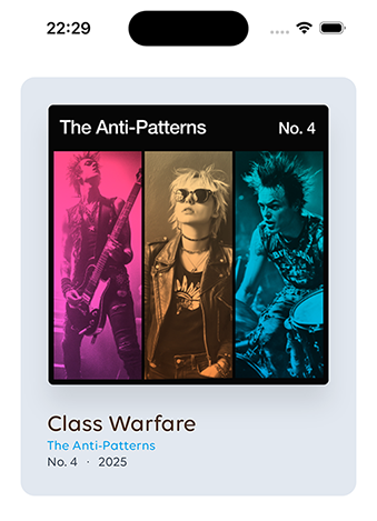 The UI we just made, but with Crosswind.
Mixing with existing mechanisms
When you’re using the default Style system in .NET MAUI, you’re probably relying on StaticResource or DynamicResource. Since Crosswind defines a range of variables like fonts, colors, and spacing it makes sense to reuse those in your styles.
To support that, Crosswind’s initialization process automatically generates a ResourceDictionary containing resource entries for all built-in and custom values. This dictionary is added to your app automatically. Because StaticResource keys can’t include hyphens, Crosswind replaces them with underscores and prefixes them with cw_ to avoid any naming collisions with your own resources. For example, to get the value represented by the m-2 class you’d use {StaticResource cw_spacing_2}. This works for:
- Spacing (e.g.
m-2,p-3) - Sizing (e.g.
size-3) - Fonts (e.g.
font-mono) - ⚠️ To be added: Colors (e.g.
text-red-300)
Conclusion
So after all that, was it worth it? I’ll let you decide. It is not perfect due to the fundamental differences between how XAML styling functions in .NET MAUI and how CSS operates. XAML styles in .NET MAUI are deeply tied to the framework’s property system, which supports direct property binding and default value inheritance, while CSS is primarily designed for styling web elements and lacks the same level of integration with a declarative UI framework like .NET MAUI. Additionally, not all properties available in XAML have direct CSS equivalents, which means that some styling capabilities, such as animation properties, shadows, or borders, may not map cleanly or be supported at all when using CSS.
What’s next?
First of all, I’d love for you to give this a try. While it’s not perfect, and maybe never will be, you might still find it useful, even if just for the simple, out-of-the-box styling options that help promote consistency across your app. The fact that all built-in variables are also exposed as resources means it should be fairly easy to integrate Crosswind into an existing styling system. That said, I totally get that mixing traditional Style usage with Crosswind utilities might feel a bit messy at times. But hey, it’s an experiment and sometimes those can lead to new insights 😄
dotnet add package Plugin.Maui.Crosswind
Links to learn more: